How to Use This Tool
Here's a question that sounds simple but reveals a lot: where does your income fall compared to everyone else in the US? It's a number people throw around casually ("I'm in the top 20%!") but rarely actually calculate. This tool makes it easy — and more importantly, it helps you understand what that percentile actually means in practice.
If you're thinking "I don't need a percentile calculator, I know what I make" — fair enough. But consider this: a $95,000 salary sounds impressive until you realize it puts you at only the 68th percentile nationally. Suddenly that "competitive offer" might need a second look. Understanding how your pay compares to similar roles in your field is a different question — but knowing your national standing first gives you a baseline for that conversation.
Use this when:
- Salary negotiation time. You have an offer in hand and want to know if it's competitive before countering. A $95,000 offer sounds like a lot — until you realize it's only the 68th percentile nationally.
- Considering a move. Comparing cost of living is important, but knowing your income percentile in both locations tells you whether you're trading up or down in earning power.
- Career check-in. Maybe you changed jobs three years ago and never re-benchmarked. Running your current salary through here gives you a quick reality check on whether you're ahead, behind, or on pace.
Worked Example: $75,000 Individual Income
Let's walk through what $75,000/year actually means in the national distribution for an individual worker:
| Percentile | Income | What It Means |
|---|---|---|
| 40th | ~$50,000 | 40% of workers earn less |
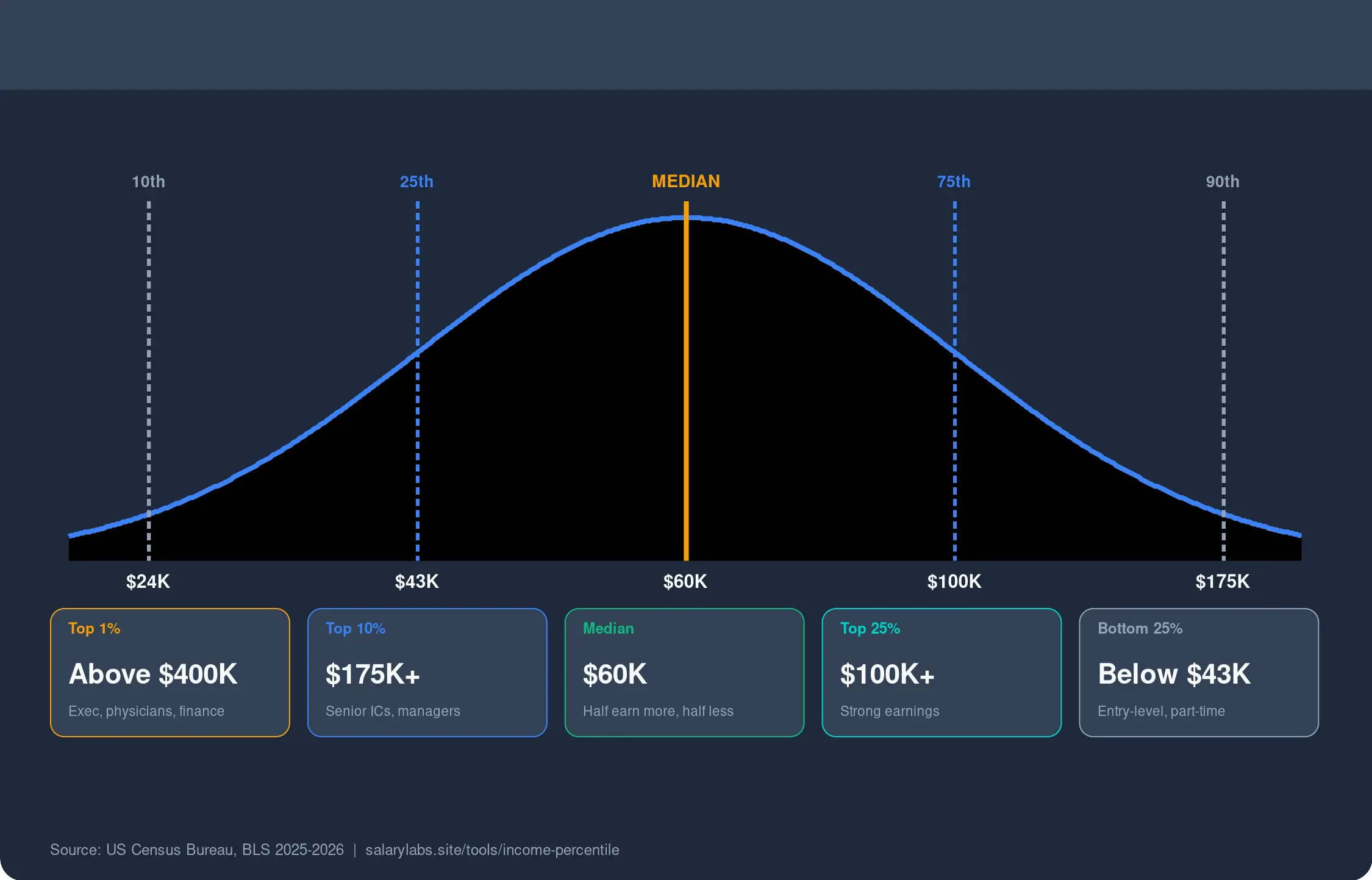
| 50th (Median) | ~$60,000 | Half earn more, half earn less |
| 58th | ~$75,000 | You — top 42% nationally |
| 68th | ~$95,000 | Above-average but not elite |
| 90th | ~$140,000 | Top 10% — high earner |
At $75,000, you're in the upper half of all US workers. But notice: you're still below the median for some industries (tech, finance, consulting) and above the median for most others. This is why national context is useful for confidence — but looking at pay by region and occupation matters more for negotiation.
About This Income Percentile Calculator
This tool uses directional income-distribution anchors informed by recent Census household income publications and BLS wage context to estimate how your income compares nationally. It is useful as a broad positioning tool, not as an exact government percentile lookup for a specific occupation.
How to Read the Percentile Without Overreaching
| If your result is... | Reasonable conclusion | Do not assume |
|---|---|---|
| Below median nationally | Your income is common but not strong in broad US terms. | That your employer is automatically underpaying you for your exact occupation. |
| Around the 70th–80th percentile | You likely have above-average national earning power. | That your city affordability or wealth position is equally strong. |
| Very high percentile | You have uncommon income relative to the national distribution. | That base salary is the only thing left worth negotiating. |
This page is strongest when it gives you context discipline, not false certainty.
Why This Page Exists On SalaryLabs
This page exists to answer one narrow but important question: where does your income sit in the broad US distribution? That is different from asking whether you are underpaid for your profession, whether your city is affordable, or whether your offer produces strong take-home cash flow.
We keep those questions separate on purpose. A percentile helps with national context and confidence framing, but it should not be mistaken for a role-specific market verdict. That is why this page is paired with occupation, tax, and geography tools elsewhere on SalaryLabs. Curious what your take-home pay would actually be after taxes at a different income level? We have calculators for that too.
Best workflow: use this page when you want national context and confidence framing, then cross-reference with role-specific salary comparisons and geographic salary data for a complete compensation picture.